Fan Fold Pop-Up Card Tutorial

Hi Stampers!

I’m back again this month with another fun card tutorial.  I saw this card awhile ago and have been wanting to give it a shot myself.  When I realized how easy it is to make I knew it would be a great tutorial share for all of you.


It’s a fan!  It’s a card! And, to top it all off…it pops up.  Can’t get any more fun than this!

I’m adding photos of the card from several different angels and also including a printable tutorial for score lines and paper dimensions that you can download and use for yourself. Get it by clicking here.   I hope you enjoy the video.  It’s quick.  I just tell you how to assemble the card.  I don’t go into any details about how to decorate.  That’s all up to you. I’ve used Floral Delight DSP and the Delightful Wishes stamp set and dies to decorate mine.  If you have any questions, let me know.  As always, I’ve included a supply list at the end of this post.


Until next time!

Happy Stamping!


More Splitcoast Creations!

Hey Stampers!

I’m back with another share from last year’s creations for Splitcoast Stampers.  I hope you’ve been enjoying seeing them as much as I enjoyed creating and sharing them with all of you.

The design team theme for last November was “Into the Woods”.  We could create anything  that included woodland animals, gnomes, mushrooms, ferns and other forest themes, fairies,  fairy tale themes, faux wood finishes , or images of things made of wood or with wooden or branch parts.  Here are the cards I created.


BELIEVE

In Celtic mythology, the unicorn is a symbol of purity, innocence and power.  They also symbolize hope and joy, and they usually appear in wooded areas.  Unicorns appear in fairy tales.  Unicorns are mystical and magical and … I BELIEVE!

STAMPS:  Grassy Grove, Leave a Little Sparkle

PAPER:  Pretty Peacock, Basic Black and Basic White

INK:  Night of Navy, Pretty Peacock, Memento Tuxedo Black, White Craft Ink

ACCESSORIES:  Blending Brushes, Recollection Unicorn Dies, Penney Black Tree Dies, Grassy Grove Dies

WOODED GLEN

These deep rich fall colors are what I envision I would see as I walked through a wooded glen during the fall; branches and leaves of gold, blue, and deep red especially in the eastern United States.  Did you know you can find these colors in the leaves of an American Gum tree in the  fall?  The American Gum tree is native to the southern and eastern U.S. and can also be found in Mexico and Central America.

STAMPS:  Autumn Leaves

PAPER:  Blackberry Bliss, Pretty Peacock, Cajun Craze, Crushed Curry, Mossy Meadow, Basic White, Gold Foil, Vellum

INK:  Blackberry Bliss

ACCESSORIES:  Blackberry Bliss and Gold Ribbon, Magical Meadow, Autumn Leaves, Changing Leaves and Encircled in nature Dies, Fern 3D Embossing Folder

FALL FERNS

On this card I used the Wild Fern Dies to frame the well wishes on this card.  “Into the woods, or should I say, into the fall woods theme is reflected in this card via the ferns and colors I chose to use.

STAMPS:  Wild Fern

PAPER:  Pretty Peacock, Basic White, Regal Winter DSP

INK: Pretty Peacock

ACCESSORIES:  Wild Fern Dies

WOODED SYMPATHY

The “into the woods” theme is reflected in this forest themed card via  the crumb cake  tree branches and colored pine trees; natural items mad of wood.  These colors reminded me of fall, a time of change.  These colors combined bring me a feeling of peace and comfort.

STAMPS:  Quiet Reflection

PAPER:  Thoughtful Journey DSP, Wild Wheat, Pretty Peacock, Night of Navy, Crumb Cake, and Old Olive

INK:  Memento Tuxedo Black

ACCESSORIES:  Mountain Air Dies (Retired) and Into the Grove Dies

HAPPY LITTLE SNOWMAN

This happy little snowman is one of my favorites from this month’s creations.The branch arms  of this happy little guy are made of wood and can be found in the woods. I used the Deckled Circle dies to create the snowman’s body and the Autumn Leaves dies to create his arms.  I  used the branch stamp from the Autumn Leaves set to stamp the bare branches next to him.  The hat and nose were cut freehand along with the mouth.

STAMPS:  Snowman Season, Autumn Leaves

PAPER:  Balmy Blue, Basic Black, Pumpkin Pie, Early Espresso, Cherry Cobbler, and Basic White

INK:  Balmy Blue, Early Espresso

ACCESSORIES:  Autumn Leaves and Deckled Circles Dies, Pastel Adhesive Backed Sequins, Rhinestones Basic Jewels, Cherry Cobbler Baker’s Twine

BIRD HOUSE

In keeping with the Into the Woods theme,I made this winter birdhouse card because birdhouses are usually made of wood.  We didn’t need to have snow according to our instructions, because we usually don’t have snow in fall unless you live in Colorado.  I also didn’t want a regular summer bird, so I found a photo of a cardinal and traced and colored him because I don’t have a cardinal stamp.  Did you know that cardinals are symbols of comfort during times of grief and loss?  My closest friend recently passed away, so maybe it was her telling me to add the cardinal.  This scene brings me a feeling of peace and calm when I imagine the quietness of the woods after a fresh snowfall on a winter’s day.  Add some pine branches and holly and a wooded background; a peaceful card.  A reminder of my dear friend…my favorite.

STAMPS:  Country Birdhouse

PAPER:  Early Espresso, Misty Moonlight, Crumb Cake, Basic White, Cherry Cobbler, Mossy Meadow

INK:  Cherry Cobbler, Mossy Meadow, Memento Tuxedo Black

ACCESSORIES:  Birchwood 3D Embossing Folder, Garden Meadows, Joy of Noel, and Country Birdhouse dies, Iridescent Pearls Basic Jewels

I’ve provided links for the Stampin’ Up! items used that are still available at the end of this post.  Each link will lead you directly to my online store.

Well, that’s all for this month.  I hope I inspired your creativity in some way today.  Until next time…

Happy Stamping!


Sale: $28.80

Price: $32.00

Sale: $15.20

Price: $38.00

Sale: $19.80

Price: $33.00


I Love My Friends!

Happy April!

I’m back this month to share more of my stamping creations from last October while I was a member of the Splitcoast Stampers Dirty Dozen Design team. Each month we were given a theme around which we were supposed to design six cards/projects.  I can’t remember what was happening last October, but when I look back at my work I only see that I shared five projects.  Must have been a busy month for me.

The theme for last October was Friends and Neighbors.  It was suggested our cards feature images of people or we make a card showing something we like to do with friends.  It was also suggested we create a card that was inspired by a friend, make a house shaped card, or create a housewarming gift.


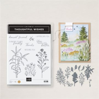
Colorado Rocky Mountain High

This wall hanging I created could very easily be used as a housewarming gift for someone who moves to Colorado.  It is one of my favorites this month.  It features a lot of things related to Colorado: bears, moose, mountains, trout, sunshine, camping and of course the Colorado state flower, the Columbine.  The two stamps I used by Ann Corbiere-Scott were created exclusively for a local paper crafting store that I like to visit on occasion.

STAMPS:  Forest Friends by Stampablities, Gone Fishing by Creative Expressions, Greetings from Colorado & Colorado Rocky Mountan stamp sets by Ann Corbiere-Scott.

PAPER: Basic white, Highland Heather, Gorgeous Grape, Pool Party, Daffodil Delight, Old Olive, Crumb Cake and Basic Black

INK: Memento Tuxedo Black, Versa Mark, Highland Heather, Old Olive, Pumpkin Pie, Real Red, Crushed Curry, and Daffodil Delight

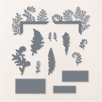
ACCESSORIES: Rugged Icons, Alphabet A La Mode, Tree Lot and Majestic Mountain Dies by Stampin’ Up!  Forest Animalsl #1 and Mountain Scene Doe Sets by Echo Park,  Stampin’ Up!  Moose Punch, White Heat Embossing Powder and Heat Tool

***A special note about this project:  I couldn’t stand to part with it so I saved it for myself!  🙂

“Our House was a Very Very Fine House”

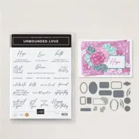
We used to have two cats in the yard too!  (If you know, you know!) This house card was very labor intensive, but I am extremely happy with how it turned out! I first sketched my house on a piece of scrap paper that measured 4-1/4” x 5-1/2” and cut it out.  Then I cut a piece of card stock for the base that measures 8-1/2” x 5-1/2” and folded it in half.  I used the house I sketched as a stencil and drew cut lines onto the card base. The top edge of the house is placed on the fold.  I cut slivers of black card stock for the outlining, etc.  I didn’t measure width…I just cut slivers.  I used pieces of Pool Party card stock for the windows, a punched pool party circle cut in half for the door window and a full circle for the window above the door.  A slightly large circle punch was used with some black card stock for the black outline around the circle window.  The door was created using a tag die from the Unbounded Love dies.  I just cut off one rounded end for the bottom of the door.  Everything was colored using Stampin’ Blends

STAMPS:  Garden Meadow and Unbounded Love

PAPER: Smoky Slate, Pool Party, Real Red, Basic Black and Basic White

INK: Memento Tuxedo Black, Fresh Freesia, Daffodil Delight, Granny Apple Green, Pecan Pie, Smoky Slate Stampin’ Blends

ACCESSORIES: Garden Meadow Dies, Unbounded Love Dies, 3/4” and 1” circle punches

Happy Birthday!

This card is a remake of one I received for my birthday.  The card I received was printed.  For this one, I cut strips of DSP approx. 1/2” x 2-1/2” and evenly spaced and attached them to white card stock.  I used dimensional to attach  to the card front.  I then punched five mini ornaments out of pumpkin pie card stock and used mini dimensional to attach them upside down with the top end under the strips to create the candle flames.

STAMPS: Sweetly Scripted

PAPER:  Berry Burst, Basic White, Pumpkn Pie, Flowering Zinnia Designer Series Paper.

INK: Berry Burst

ACCESSORIES: Retired mini-tree ornament punch

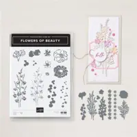
Another Card Re-Make

This is a remake of another friend’s card.  Her card was beautiful!  I just did a few things differently.  First, I added a sentiment, and instead of stamping the strip under the sentiment, I used a piece of DSP.  I also changed the colors. Her card was light purple and green.  Mine is Night of Navy and Highland Heather.  I also added a stamped image above the sentiment.  Her square was punched out with a punched out of a piece of light purple card stock beneath the top white layer.  I cut a square out of basic white and applied it over the base of the stems.  She also used an embossing folder for the thin strip of embossing under the flowers.  I used my Simply Score tool to make scored lines under the flowers.

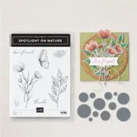
STAMPS:  Spotlight on Nature

PAPER:  Night of Navy, Basic White, Highland Heather, Retired DSP,  Vellum

INK:  Highland Heather

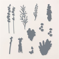
ACCESSORIES:  Stylish Shapes Dies, Painted Lavender Dies, Retired Flower Punch, Iridescent Pearls

Wine Not!

Yes, another old and retired stamp set, and another thing I like to do with friends!  It’s an old favorite as well. My husband and I consider ourselves wine connoisseurs; we even make our own wine.  Some would say “winos” is a better description.  LOL!  I come from a long line of Italian home made wine makers and getting my “wanna be Italian” husband into the craft was easy. We enjoy sharing a glass with friends and family members while catching up on life.

STAMPS: Half Full, Tuscan Vineyard, Unbounded Love

PAPER: Basic White, Crumb Cake, Shaded Spruce, Berry Burst

INK: Berry Burst, Shaded Spruce, Memento Tuxedo Black

ACCESSORIES:  Deckled Circle Dies, Stripes 3D Embossing Folder.

Well that’s it for this month.  I’ ve a few technique videos in the planning stages and I’ll get to work on them as soon as possible.  It has been awhile since a video and it’s time to get back at it.  NOTE:  If an item doesn’t appear in the list of supplies below it is because it is retired or not a Stampin’ Up! item.

Hope you enjoyed your visit here today.  Until next time…

Happy Stamping!

&


Sale: $16.00

Price: $32.00

nbsp;


This March is Last September

Hello Everyone!

If you have been following me for awhile, you will know that I have been sharing my creations for the last six months of last year when I was a part of the Splitcoast Stampers Dirty Dozen Design Team.  So this month I will be sharing the cards I created for Splitcoast in September 2024.

The theme for last September was “Deja Hue. A play on words with Deja Vu: the illusion of remembering scenes and events when experienced for the first time. Instead of scenes and events, remember colors (hues)”. We were told to make a new card inspired by the colors of an older card in our gallery. It was also suggested we use a color combination that has meaning in our lives, like our school colors, wedding colors, favorite sports team colors, etc.   We were also directed to other color challenges on Splitcoast in order to find inspiration for our own creations. So…here are the cards I came up with.  I hope you enjoy them.

Cuppa Brew

I originally used these colors in my February 7, 2024 gallery card.  part of this month’s theme was to make a different card using the same colors as in a previous card.  I think these colors go well together with this adorable set which is still available.  Coffee is my go-to drink all day long.  It’s my go juice and I love this set.

STAMP SET:  Latte Love (Retired)

PAPER:  Copper Clay, Pool Party, Basic White

INK:  Copper Clay, Pool Party, Early Espresso

ACCESSORIES :  Latte Love

A Million Thanks

After watching a Brusho coloring technique video, I decided I would give it a try myself.  I’ve known about Brusho Water Color Crystals for a while…I’ve even owned some for a while as well, but I never bothered trying to use them.  since purple is my favorite color I decided to play with violet and a background stencil that I got somewhere along the line.  It might even be left over from my teaching days.  t took me a few tries to get the look I wanted.  My first few attempts created a watercolor mess.  Eventually I managed to pump out this.  not bad for ever using Brusho, I would say.

STAMPS:  Sweetly Scripted (Retired)

PAPER:  Night of Navy, Highland Heather, Watercolor Paper, Basic White

INK:  Night of Navy

TECHNIQUES:  Brusho Watercolor Crystals with a Stencil

Black, White & a Pop of Color

Part of this month’s theme was to watch a coloring technique video or to make a card out of the colors recommended in a previous color challenge.  This is my version of the color challenge that called for black, white, and a pop of color.

STAMPS: Irresistible Blooms (Retired)

PAPER: Basic Black and Basic White

INK:  Tuxedo Memento Black, Versa Mark, Real Red Stampin’ Blend, white embossing powder

TECHNIQUES:  Heat Embossing

School Colors

Part of this month’s theme was to make a card using a color combination that has meaning to me.  Well, in this card I managed to pay homage to all three of my Alma Maters; Struthers High School (red & black), Youngstown State University (red & white), and University of Colorado, Colorado Springs (black & gold). I created a red background by coloring a clear clear block (E) with my Real Red Stampin’ Write marker, spritzing it with water, and then stamping it onto a piece of watercolor paper.  Tthen used an aqua painter to smooth out the ink.

STAMP: Thoughtful Wishes

PAPER: Basic Black, Real Red, Basic White, Watercolor Paper

INK:  Memento Tuxedo Black, Real Red Crushed Curry

ACCESSORIES:  Thoughtful Wishes Dies, Real Red Stampin’ Write Maarker, Aqua Painter, Clear Block E, Stampin’ Spritzer

Another Color Challenge Remake

These are colors I would have never thought of putting together, but after looking at another color challenge….TA–DA!

STAMPS:  Flowers of Beauty

PAPER:  Blueberry Bushel, Highland Heather, Basic White

INK:  Blueberry Bushel, Petal Pink, Peach Pie

ACCESSORIES:  Flowers of Beauty Dies, Perennial Postage Dies, Iridescent Pearls, 3/8″ Peach Pie Ribbon, Basics Embossing Folders.

My Favorite

This card is my favorite!  I used the reverse emboss blackout technique to create this card.  It is done by dragging your ink pads over the back side (indented side) of an embossed piece so that only the raised edges catch the color.  You start with the colors you want first, and then you add the black to the background.  The hues in this card remind me of fall.

STAMPS:  Changing Leaves

PAPER:  Pretty Peacock, Wild Wheat, Basic White, Crushed Curry

INK:  Pretty Peacock, Crushed Curry, Wild Wheat, Memento Tuxedo Black

ACCESSORIES:  Changing Leaves Hybrid Embossing Folder & Dies, Crushed Curry Baker’s Twine, Opal Rounds

TECHNIQUES:  Reverse Emboss Blackout

So that is it for this month.  Hope you enjoyed your visit.  Until next time…

Happy Stamping!