Hello Everyone!
If you have been following me for awhile, you will know that I have been sharing my creations for the last six months of last year when I was a part of the Splitcoast Stampers Dirty Dozen Design Team. So this month I will be sharing the cards I created for Splitcoast in September 2024.
The theme for last September was “Deja Hue. A play on words with Deja Vu: the illusion of remembering scenes and events when experienced for the first time. Instead of scenes and events, remember colors (hues)”. We were told to make a new card inspired by the colors of an older card in our gallery. It was also suggested we use a color combination that has meaning in our lives, like our school colors, wedding colors, favorite sports team colors, etc. We were also directed to other color challenges on Splitcoast in order to find inspiration for our own creations. So…here are the cards I came up with. I hope you enjoy them.
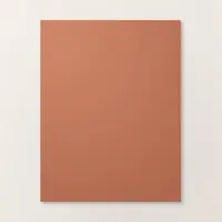
Cuppa Brew

I originally used these colors in my February 7, 2024 gallery card. part of this month’s theme was to make a different card using the same colors as in a previous card. I think these colors go well together with this adorable set which is still available. Coffee is my go-to drink all day long. It’s my go juice and I love this set.
STAMP SET: Latte Love (Retired)
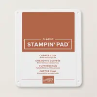
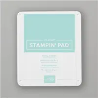
PAPER: Copper Clay, Pool Party, Basic White
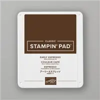
INK: Copper Clay, Pool Party, Early Espresso
ACCESSORIES : Latte Love
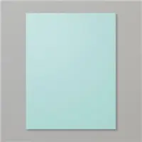
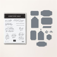
A Million Thanks

After watching a Brusho coloring technique video, I decided I would give it a try myself. I’ve known about Brusho Water Color Crystals for a while…I’ve even owned some for a while as well, but I never bothered trying to use them. since purple is my favorite color I decided to play with violet and a background stencil that I got somewhere along the line. It might even be left over from my teaching days. t took me a few tries to get the look I wanted. My first few attempts created a watercolor mess. Eventually I managed to pump out this. not bad for ever using Brusho, I would say.
STAMPS: Sweetly Scripted (Retired)
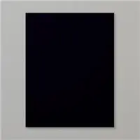
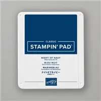
PAPER: Night of Navy, Highland Heather, Watercolor Paper, Basic White
INK: Night of Navy
TECHNIQUES: Brusho Watercolor Crystals with a Stencil
Black, White & a Pop of Color

Part of this month’s theme was to watch a coloring technique video or to make a card out of the colors recommended in a previous color challenge. This is my version of the color challenge that called for black, white, and a pop of color.
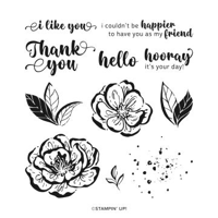
STAMPS: Irresistible Blooms (Retired)
PAPER: Basic Black and Basic White
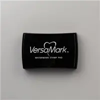
INK: Tuxedo Memento Black, Versa Mark, Real Red Stampin’ Blend, white embossing powder
TECHNIQUES: Heat Embossing
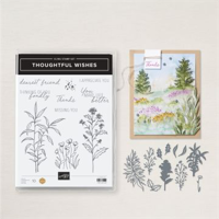
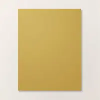
School Colors

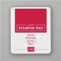
Part of this month’s theme was to make a card using a color combination that has meaning to me. Well, in this card I managed to pay homage to all three of my Alma Maters; Struthers High School (red & black), Youngstown State University (red & white), and University of Colorado, Colorado Springs (black & gold). I created a red background by coloring a clear clear block (E) with my Real Red Stampin’ Write marker, spritzing it with water, and then stamping it onto a piece of watercolor paper. Tthen used an aqua painter to smooth out the ink.
STAMP: Thoughtful Wishes
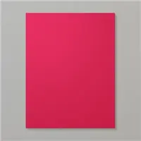
PAPER: Basic Black, Real Red, Basic White, Watercolor Paper
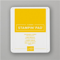
INK: Memento Tuxedo Black, Real Red Crushed Curry
ACCESSORIES: Thoughtful Wishes Dies, Real Red Stampin’ Write Maarker, Aqua Painter, Clear Block E, Stampin’ Spritzer
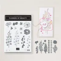
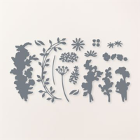
Another Color Challenge Remake

These are colors I would have never thought of putting together, but after looking at another color challenge….TA–DA!
STAMPS: Flowers of Beauty
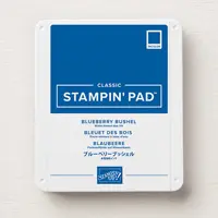
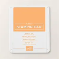
PAPER: Blueberry Bushel, Highland Heather, Basic White
INK: Blueberry Bushel, Petal Pink, Peach Pie
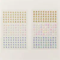
ACCESSORIES: Flowers of Beauty Dies, Perennial Postage Dies, Iridescent Pearls, 3/8″ Peach Pie Ribbon, Basics Embossing Folders.
My Favorite

This card is my favorite! I used the reverse emboss blackout technique to create this card. It is done by dragging your ink pads over the back side (indented side) of an embossed piece so that only the raised edges catch the color. You start with the colors you want first, and then you add the black to the background. The hues in this card remind me of fall.
STAMPS: Changing Leaves
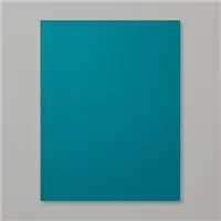
PAPER: Pretty Peacock, Wild Wheat, Basic White, Crushed Curry
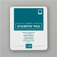
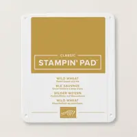
INK: Pretty Peacock, Crushed Curry, Wild Wheat, Memento Tuxedo Black
ACCESSORIES: Changing Leaves Hybrid Embossing Folder & Dies, Crushed Curry Baker’s Twine, Opal Rounds
TECHNIQUES: Reverse Emboss Blackout
So that is it for this month. Hope you enjoyed your visit. Until next time…
Happy Stamping!


You must be logged in to post a comment.